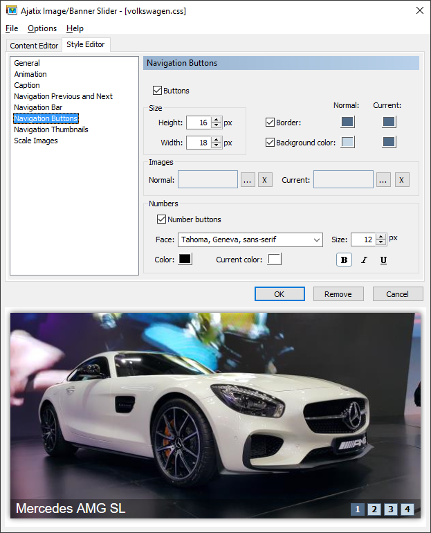
Navigation Buttons Style
Select Navigation Buttons to access navigation buttons style settings.

Buttons
Turns navigation buttons on and off.
Height
Specifies the height of the buttons.
Width
Specifies the width of the buttons.
Border
Turns buttons border on and off.
Background color
Turns buttons background on and off.
Images
Allows to use images for the navigation buttons.
Number buttons
When set, the buttons will display numbers of the images inside them.
Face
Specifies the font face.
Size
Defines the font size in pixels.
Bold, Italic, Underline
Specifies text weight, style, and decoration.
(Text) Color
Sets the text color.
Normal and Current colors and background images
Different sets of colors and background images can be defined for the normal and for the current states of buttons. Colors and background images of a button will switch to the current values when the mouse is over it or when the image associated with the button is being displayed, and back to normal when another image is displayed.

